MessageDialog
A built-in React component of Inkdrop that allows you to display a simple modal dialog with buttons.
To get the class of MessageDialog component:
const MessageDialog = inkdrop.components.getComponentClass('MessageDialog')Props
type Props = {|
  title: string | (() => React.Node),
  message: string,
  buttons: MessageDialogButton[],
  autofocus: boolean,
  className?: string,
  onDismiss?: (dialog: MessageDialog, buttonIndex: number) => boolean,
  onHidden?: (dialog: MessageDialog, buttonIndex: number) => any,
  children: React.Node,
  // See: https://semantic-ui.com/modules/modal.html#/settings
  modalSettings?: Object
|}

type MessageDialogButton = {
  label: string,
  primary?: boolean,
  destructive?: boolean
}
Example
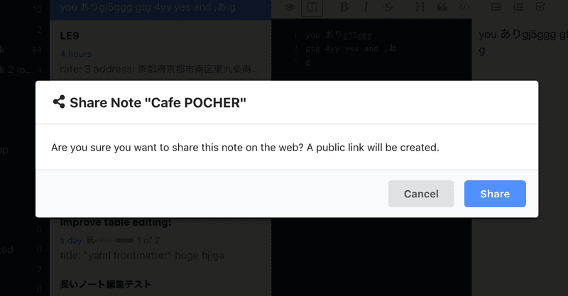
<MessageDialog
title={() => (
<span>
<i className="share alternate icon" />
Share Note "{note && note.title}"
</span>
)}
buttons={[
{ label: 'Cancel', cancel: true },
{ label: 'Share', primary: true }
]}
onDismiss={(caller, buttonIndex) => {
if (buttonIndex === 1 /* Share */) {
// prevent the dialog from closing
return false
} else {
return true
}
}}
>
<p>
Are you sure you want to share this note on the web? A public link will be
created.
</p>
</MessageDialog>It produces:

Customizing modal dialog
The dialog is based on Semantic UI's Modal component.
If you would like to customize it, you can specify modalSettings prop.
Supported values are documented here.
<MessageDialog
  ...
  modalSettings={{ closable: true }}
>
  <p>
    ...
  </p>
</MessageDialog>
Can you help us improve these docs?
The source of these docs is here on GitHub. If you see a way these docs can be improved, please fork us!